

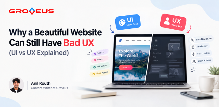
Learn why beautiful websites can still have poor UX. Discover how navigation, readability, speed, animations and user-first web design improve usability.
Ever Thought a Beautiful Website Could Still Have Bad UX? It Happens More Than You Think.
You just spent three weeks getting a font pairing right. And here’s what nobody wants to hear: a website can look amazing and still be a pain to use. It happens all the time.
These sites have great colours, buttery animations, and fonts that look like they belong in a design portfolio. All of that grabs attention fast. Like, genuinely fast. But there's a catch nobody talks about enough: looking good and being usable aren't the same skill, and plenty of sites you come across are really only good at one of them. Either they look tempting like chocolate or function incredibly well.
This is usually where many people mix up UI and UX, and honestly, it's an easy mix-up to make. UI is basically the outfit: colours, shapes, how everything's arranged. UX is whether you can actually get where you're going while wearing it. Imagine wearing a heavy, formal Sherwani to play a football match. Odd, right? That’s the same with websites that don't follow UX rules. You can design a great-looking website but still ruin the experience. The sites that get it right, do both. They look sharp, but they also let you find what you need and finish what you came to do without wanting to close the tab halfway through.
So let's get into why "pretty" and "functional" don't always show up together.
Looking Good is not equal to Easy to Use
Some sites are clearly built to be different. Odd layouts. Menus that stay hidden until you go looking. Navigation that feels like a puzzle box, not a way to get around. That can be memorable. It can also be a huge pain.
No one comes to a website to play detective. If you're trying to buy something, ask a question, or just understand what a business actually does, that path should be obvious. Right there. Not buried behind three clicks and a hover menu.
A bold design only earns its keep if people can still find the "contact us" button without an actual treasure map.
Too Much Animation Becomes Noise
A little bit of movement can make a website feel alive. A button changes when you move your mouse over it, or something moves smoothly into place. This shows you that something happened and makes the site feel like it reacts to you. That’s good.
But there is a limit. Many sites go past it without knowing.
When everything on the screen slides, bounces, pops up, or fades in, people can’t focus on any one thing. Their eyes don’t know where to look. And on slow internet or old phones, all that movement makes the whole page slower.
A good way to check: if the animation doesn’t help someone understand something or make an action feel smoother, it probably isn’t adding value. It’s just decoration that makes the page take longer to load.
Don't Let Style Ruin Readability
Sometimes people pick a font just because it looks cool on an idea board. They do the same with colors and spacing. That’s fine until someone has to read the page. Then light gray text on a white background can really hurt their eyes.
Tiny text, text that doesn’t stand out enough, and fancy fonts that look more like art than letters all make reading hard. Big blocks of text with no headings or breaks cause the same problem.
Good design should make reading easy. People should be able to look over a page, find what matters, and understand it without having to try twice.
Stop Making People Guess
One of the most common and most avoidable UX problems is an unclear path forward. The site looks great. Everything's polished. And yet somehow, the visitor still doesn't know what they're supposed to do next.
Maybe the button just says "Learn More" and gives zero indication of where it leads. Maybe the one page someone actually needs is buried three menus deep, like it's being protected. Either way, nobody should have to gamble on whether to click, scroll, or start searching blindly.
Clear navigation and buttons that actually say what they do are what let people move through a site without thinking twice.
A Slow Site Can Undo Your Every Effort
Big background videos, high-res images, layered animations - I agree, they can make a site feel premium. They can also turn a simple page load into a small eternity.
And here's the reality: almost nobody waits around for a slow site. If it takes too long, people are already gone and they will never even see the design you spent weeks on.
Speed isn't some bonus feature tacked onto good UX. It’s part of the experience. A gorgeous site that loads slowly is just a slow site wearing a nice outfit.
Good Design Starts With the User, Not with the Aesthetic
A site built purely to impress is missing the point a little. The good ones are built to help.
Before you add something flashy, ask yourself one simple thing. Will this actually make the site easier for the person using it? If it won't, then no amount of pretty details will fix it.
The best websites follow a few basic rules. They look good, but they don't distract. They're creative, but not confusing. They feel modern, but they don't get slow.
A beautiful website might get someone through the door. But it's the experience that decides whether they stay or just quietly leave.
Comments 0