Responsive Website Designing
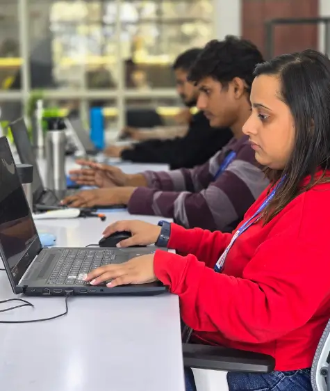
In today's digital environment, a website that isn't able to adapt based on what type of device is being used will not survive long. People could be using a smart phone to quickly look something up, a tablet while waiting to meet up with someone or sitting at their large monitor while working from home. Whatever device they use at whatever time, your company's website should react to the specific device and provide a seamless experience for the user. This is the basis of responsive web design/Responsive web sites and is where Groveus focuses their expertise.
Companies too often overlook that they lose customers when their web site has a bad experience on the mobile device. If an individual is unable to click a button because it is too small, or if someone is unable to read the text due to it shrinking too much, or if an image fails to scale to fit the device properly; each of these small issues could potentially lead to losing customers. The objective of Groveus is to eliminate these issues and design websites that feel as though they belong on each device type.
At Groveus, responsive design is not treated as a "feature." It is part of the identity your brand presents online. Every layout, every grid, and every animation is built to resize, adapt, and deliver the exact same clarity everywhere.
Why Responsive Website Design Matters More Today
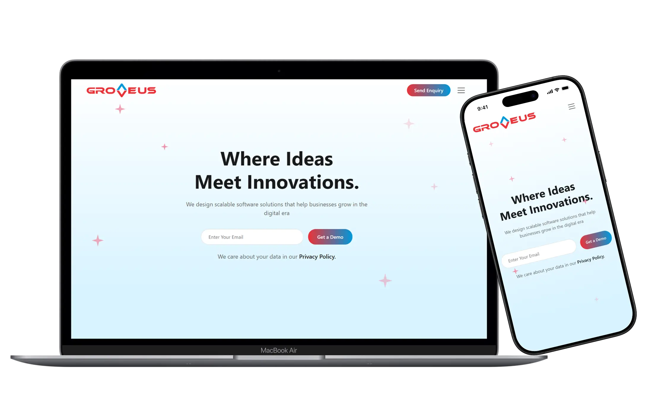
The internet no longer relies on one standard screen size. People switch devices constantly. This means that a consumer going to your site's on a smartphone, then returning to the same site on their PC at work and then finishing their order on an iPad will not feel comfortable making their purchase from your company if the look of the website drastically changes with each different device used to access it.
Responsive design is a process of designing and developing websites/apps in such a way that they adjust to the size of the device being used to view them. A responsive web site design has navigation and images that automatically change size based on the width and height of the user's monitor. If there is no longer sufficient space for multiple columns of content on the monitor, they will simply become stacked blocks of content. All design features on the web site will be displayed the same way on any device used to view the site.
Also, businesses that choose a responsive web design are experiencing increased consumer engagement, longer session lengths, and improved search engine rankings.Google has begun to give preference to mobile-friendly web sites, making responsive web design a must have for all businesses.
How Groveus Designs Responsive Websites to Feel Natural
We do not rely on shortcuts or rigid templates. Each website we create is shaped around the behavior of your audience, industry, and content type. Our approach is detailed and practical.
- Mobile-First Structure Our design concept is not based on the desktop experience only for the sake of making it smaller; rather, we start our designs from mobile and focus on the most essential aspects of responsive web design – Clarity, Speed and Simplicity.
- Fluid Grid Framework Our layouts use fluid grid website design, meaning each block expands or contracts smoothly depending on screen width. Nothing jumps awkwardly or collapses unpredictably.
- Flexible Media and Scalable Elements Increasing the size of images, icons, content blocks and banners make it possible to maintain similar branding guidelines across all platforms. This eliminates the need to deal with fuzziness and also provides similar branding in a good way for both small and large screens.
- Using Developer
Techniques for Adaptive UI/UX
We don't force the same interface across devices. For example:
- Menu becomes a hamburger icon on mobile
- Footer compresses into smaller stacked sections
- Buttons grow larger for touch interactions
This is true adaptive website design, designed for real people, not just ideal conditions.
- Performance Optimization Responsive design fails if pages load slowly. We reduce the script weight on every website we create, we compress all of our assets, we utilise the next-generation format for images, and we optimise the front end of our projects for speed.
- Ongoing Testing of
All Websites
Before launch, we test across multiple screen sizes:
- Android phones
- iPhones
- Tablets
- Laptops
- High-resolution monitors
Each version must work perfectly before we sign off.
- Features of Groveus Responsive Web
Design Services
Every website we create has a blend of modern UI elements, branding personality and
Technology precision; some of the highlights are:
- Mobile Friendly Web Layouts and Design The layout responds instantly and feels natural even on the smallest screens.
- Adaptive Typography Text scales smartly. Headers adjust their hierarchy, and content remains readable without zoom or struggle.
- Clean Navigation Across All Devices Menus, dropdowns, and links convert to mobile-optimized interactions.
- Optimized for Speed Having highly optimised pages means the fastest loading pages will reduce your bounce rate and increase your SERPS (Search Engine Results).
- Multi-Browser Compatible Layouts. Chrome, Safari, Firefox, Edge – your site looks consistent everywhere.
- Touch-Friendly Elements Buttons, sliders, and forms adapt to touch interactions without misclicks.
- High-Quality Visual Experience Graphics remain sharp and crisp across screen densities due to scalable design.
- SEO-Friendly Architecture Search engines prefer responsive structure. Our sites follow Google's mobile-first indexing standards.
Why Businesses Choose Groveus for Responsive Website Designing
Businesses don't just need a website that looks good – they need one that actively helps them grow. That is where Groveus stands apart.
-
Professional Responsive Web Development Team The team of developers and designers at Groveus fully understands the subtleties of screen breakpoints, between the CSS frameworks, user behaviour patterns and Device Specifics.
-
Industry-Specific Design Approach A corporate website needs a different structure compared to a startup or e-commerce store. We tailor the design for your audience.
-
Affordable But High-Quality We offer cost-effective responsive website designing, ensuring every business—small or large – can access premium design quality.
-
Balanced UI/UX Execution Our team blends beauty with practicality. Every choice—colors, spacing, typography – supports your brand message.
-
Future-Ready Framework Your business grows, and your website should grow with it. Our responsive designs allow easy expansion without breaking the layout.
-
Clear Communication We walk you through the design logic so you understand how each element functions across devices.
Groveus: A Complete Responsive Design Partner
We don't just build responsive websites. We help shape digital identities.
Our services include:
- Responsive UI/UX design services
- Custom responsive web design
- Mobile-first website layouts
- Corporate responsive website designing
- Front-end responsive development
- Business website responsive design
- Tablet and mobile optimized website structures
- Groveus responsive web designing solutions
Every project begins by understanding the brand impression you want customers to experience.
How Responsive Design Supports Business Growth
A responsive website brings direct benefits:
- Better visibility across devices Your audience sees a consistent design, whether on mobile or desktop.
- Higher engagement Visitors stay longer when content is easy to read and navigate.
- More conversions Responsive websites improve form submissions, enquiries, and sales.
- Lower maintenance cost You operate one site, as opposed to two separate sites for desktop and mobile devices.
- Improved SEO Rankings A mobile-friendly web site will rank higher in the search engine results pages than a non-mobile web site.
It is imperative for all business owners to recognize that in the current online marketplace, it is essential that you create responsive web design. It is the backbone of modern digital presence.
Build a Responsive Website That Actually Works – With Groveus
After a visitor leaves your website, their visit is determined by the first few seconds of their experience. Then they choose to explore further or abandon the site. A responsive layout ensures they stay – because it feels comfortable, fast, and clean on whatever device they use.
At Groveus, we are committed to developing websites that naturally fit your company and have the same type of performance over time by reflecting the brand value of your organisation from all aspects. Whether you are looking to refresh your existing website, or develop and build a completely new website to meet your long-term needs for digital presence, we'll build it for you.
The way your website represents your business is the first impression potential clients get of it. Make sure it adjusts, responds, and delivers – every single time.